Branding
LOOPA brand creation
LOOPA is a new luxury self-care business based in the Bristol area, that is customer led with sustainability at it’s heart. What sets LOOPA apart from most other distributors in their sector is their three main values: 1. Sustainability: Their products are and will always be, both natural and organic in composition and all products and packaging are made of recycled materials and are themselves fully recyclable. 2. Function: The function of the products is a combination of quality, ergonomics and positive tactile response. The dispensers are well made, using high grade materials with exceptional attention to detail. 3. Form: The form of the products, from soap, the soap dispensers and the packaging is stylish, timeless and well made without sacrificing the overall function of the products themselves.
These three values govern the operations and future growth plans of LOOPA and will be integral in the selection and addition of new products and services to the LOOPA brand.
Branding
-
Brand guidelines
-
Logo design
-
Adobe CC
Discovery session
At the start of a branding project it is vital that I get to know a client and their business to establish whether or not a rebrand is necessary. Sometimes it isn’t the right time for that business due to growth and development challenges, knowledge of ones business etc… Sometimes a refresh is required instead of starting from scratch. Once this is established an interview process begins that reveals what I need to know to move the project forward and acts as an information gathering platform. The information required will help the development of this brand and will also uncover what the brand will need to survive in its lifetime i.e. aggressive growth plans, introductions of new products and services, expansion into new territories around the globe and so on.
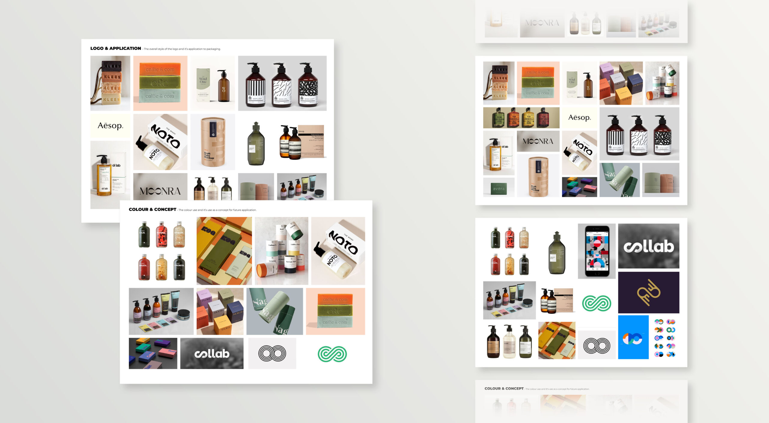
Mood board
Mood boards are a vital step in the visual direction of a brand and helps me to get to know a client and their business in a different way. I get to know how they see their brand in the wider world. For LOOPA we researched future application as well as inspiration for logo design because this was going to be the application most used for the brand and one that could also cause problems if done incorrectly i.e. materials not reacting well to certain print applications/methods if certain visual effects were used to create the logo i.e. gradients, complex layering etc…
Mood boards often go through various iterations before sign off is achieved and this was the case for LOOPA.
Concept stage
After gathering the information I needed in the discovery stage and establishing visual directions in the mood board stage, design could then begin on the concept directions. This particular brands values concentrate on environmental impact and conservation and the need to use natural products, ingredients and materials within ever step of its operation. It became clear that a symbol/asset was required to visualise this in a simple and impactful way.
Concept 1 development and mock ups to visualise potential of this concept to the client and to outline deliverable assets.
Concept 2 development and mock ups to visualise potential of this concept to the client and to outline deliverable assets.
Further development & delivery
After meeting with the client to discuss the concept stage and to gather feedback a choice is made as to the direction the brand will go in. This either results in one of the two concept directions being chosen outright, a further development of the chosen concept or a mixture of the two to create the final result. In LOOPA’s case, the second concept was chosen outright and we moved this into further development. The most worked on element turned out to be the fine tuning of colour that was define both the brand and each product individually.
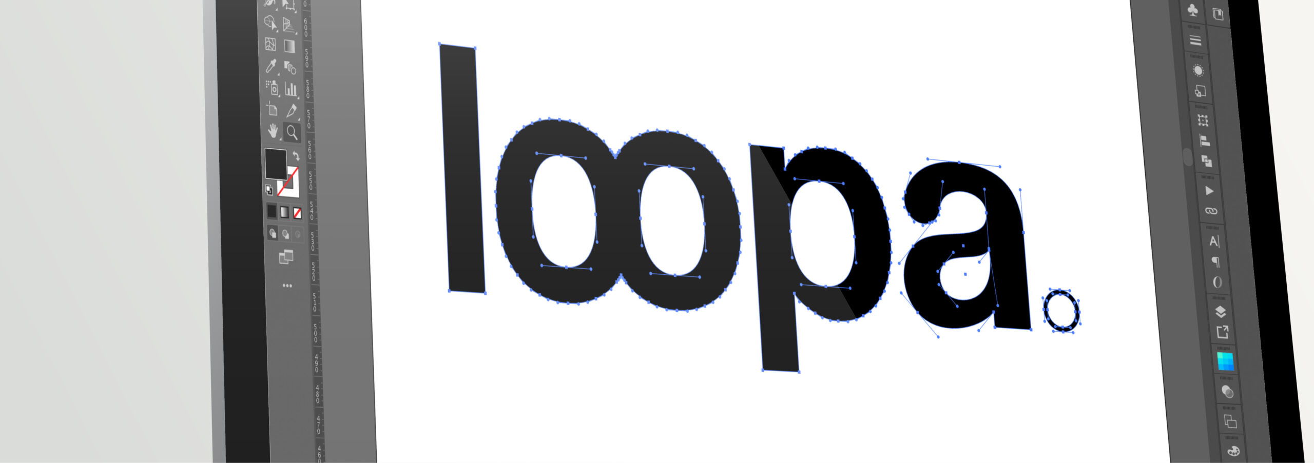
The chosen concept is then completely redrawn to eliminate any errors in structure and to improve on aspects that arose through discussion with the client after the concept stage of the project.
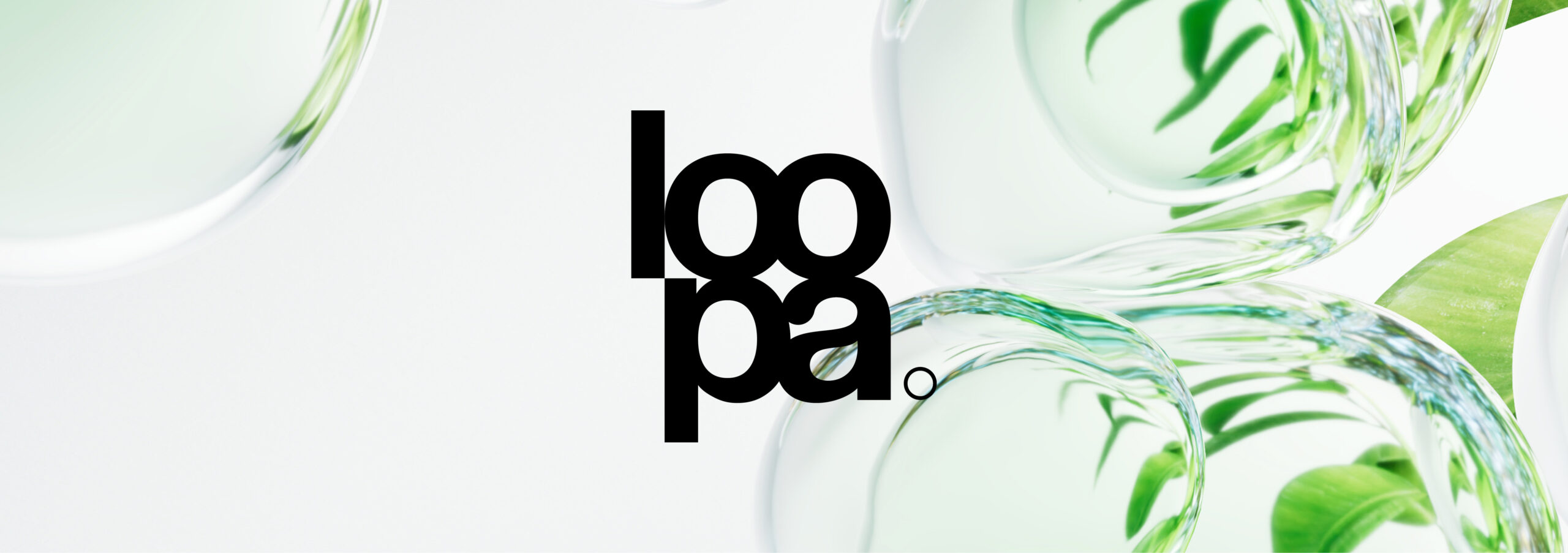
The final logo presented onto a piece of on brand photography.
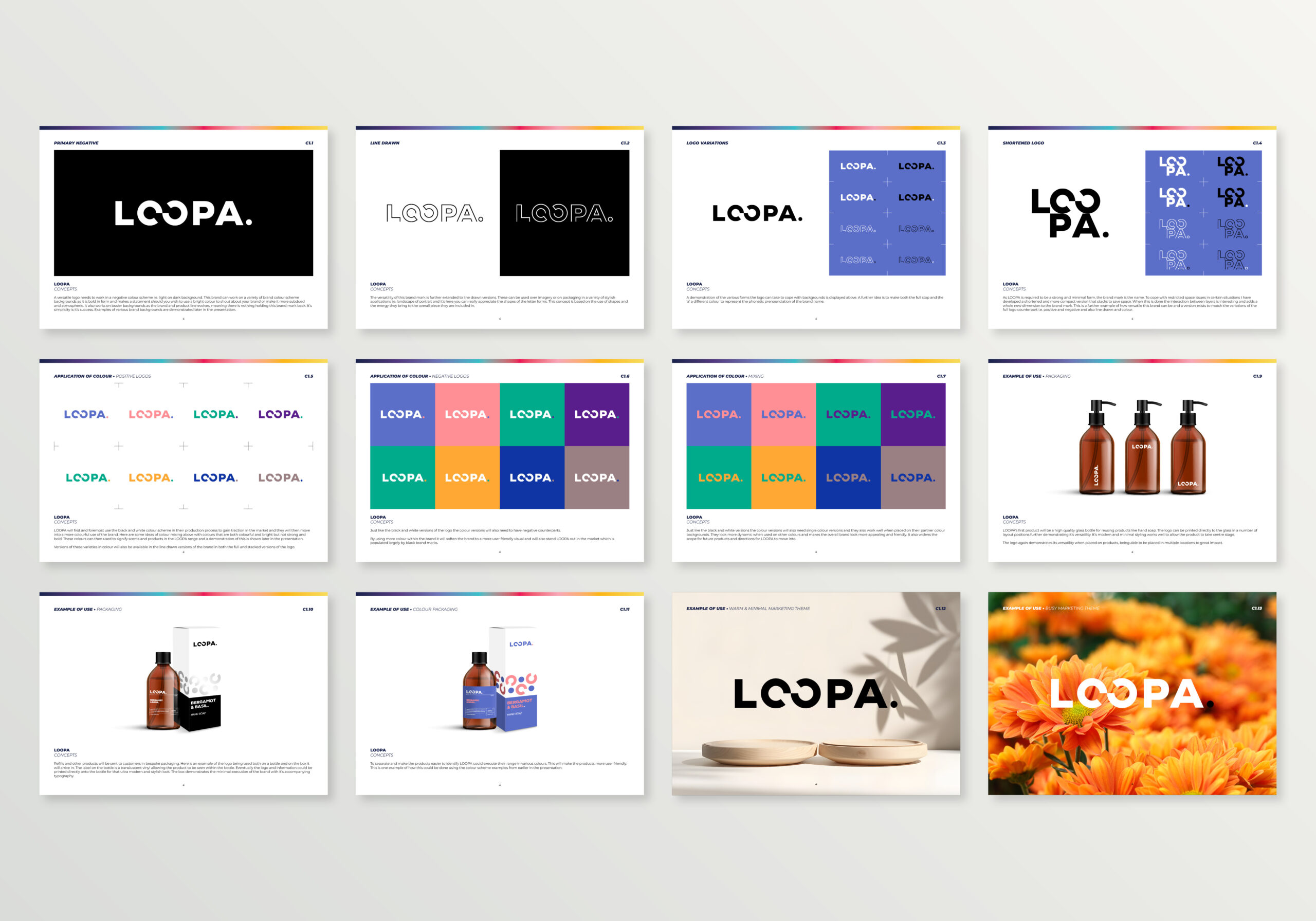
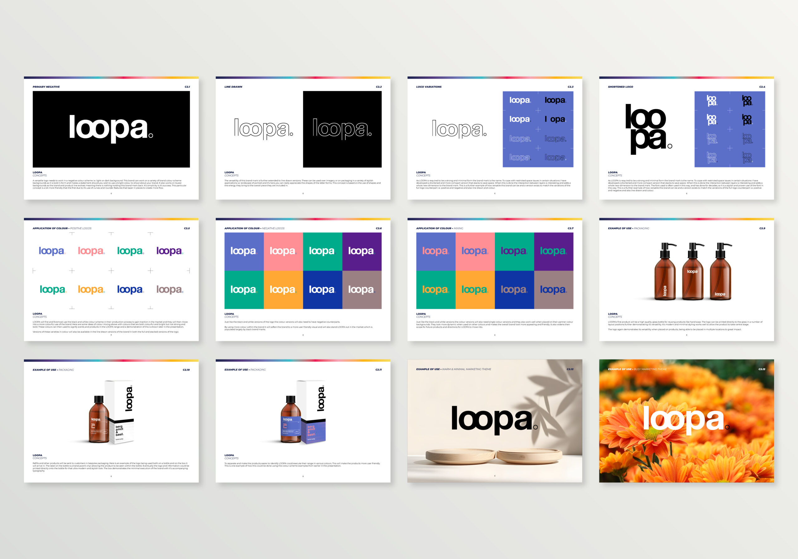
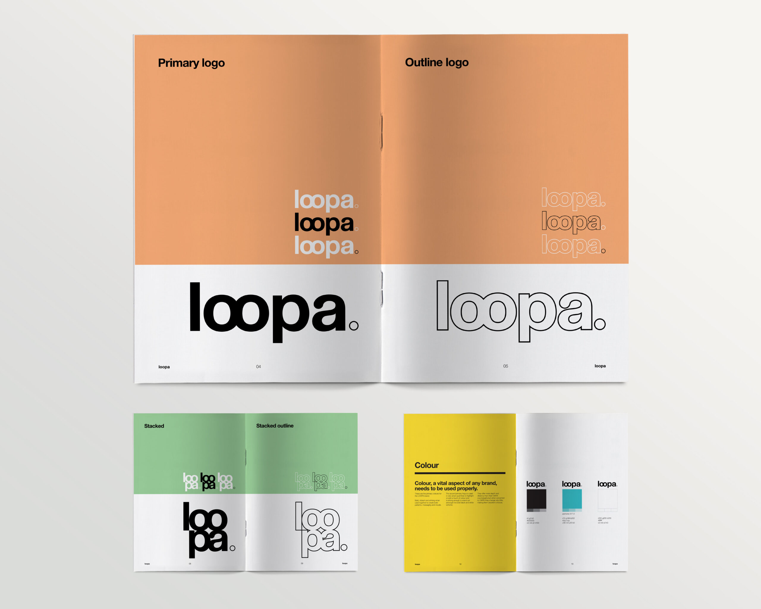
Other layout variations have also been developed to enhance the versatility of the LOOPA brand.
Line drawn variations were also supplied to act as watermarks or as cropping areas for imagery intended for future marketing campaigns.
A brand asset has also been developed that represents the client’s ethos and values of environmental awareness and sourcing of ingredients and materials within their products and packaging.
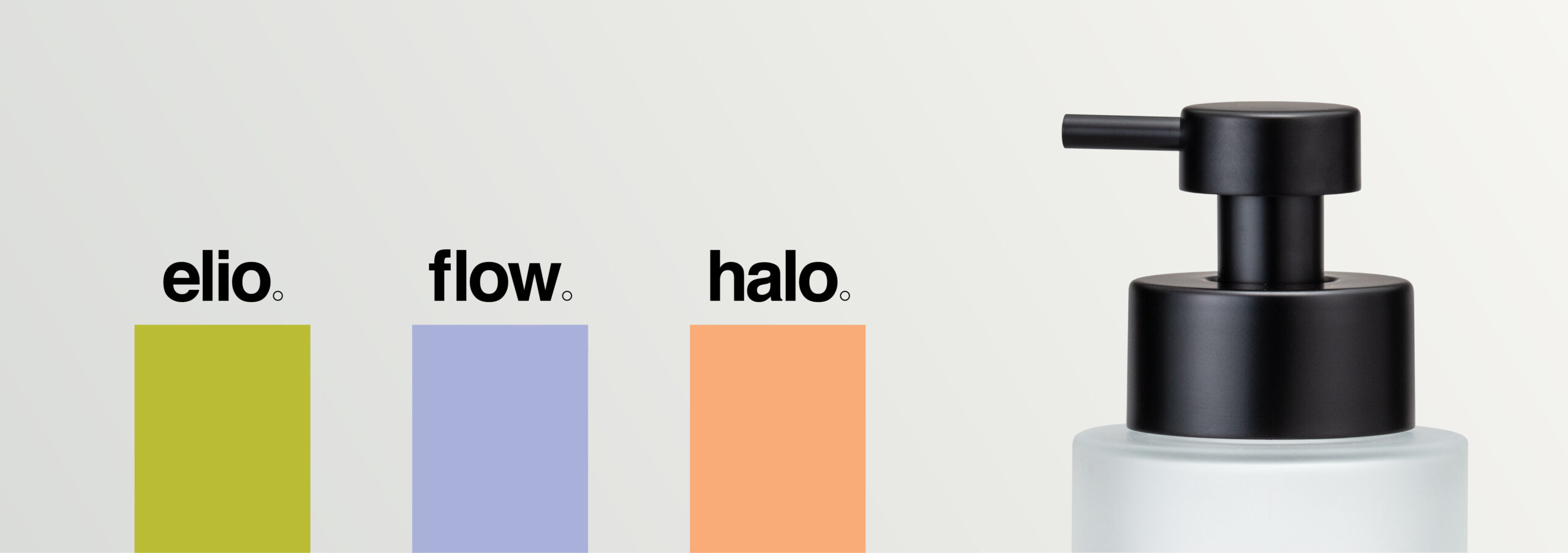
Currently the product line is divided into two product categories: Soap and Diffusers. These are the soap names and colours attributed to the packaging of these products.
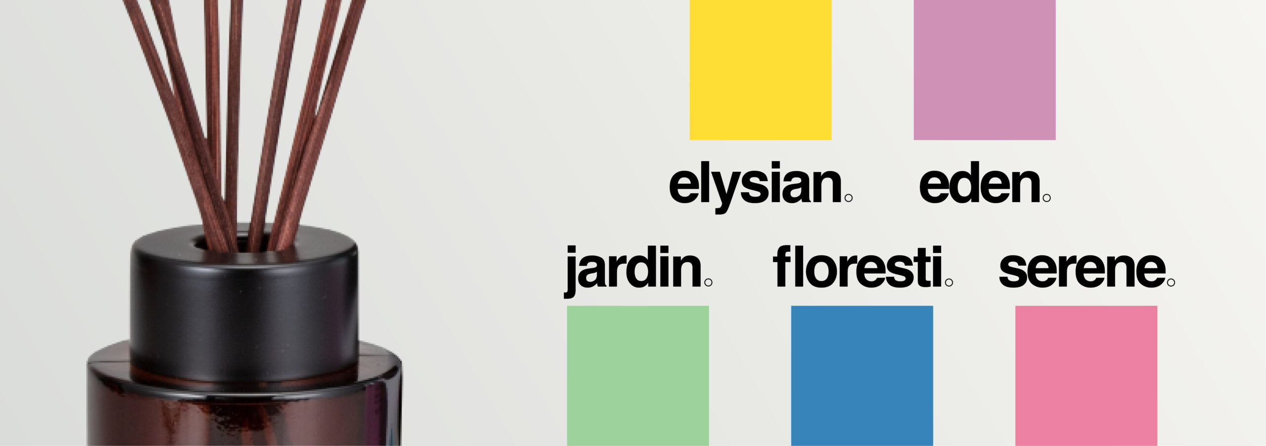
Here are the Diffuser names and colours attributed to the packaging. The colours become identifiers of these products while the bold black names provide a strong contrast to aid those with visual impairments.
Materials
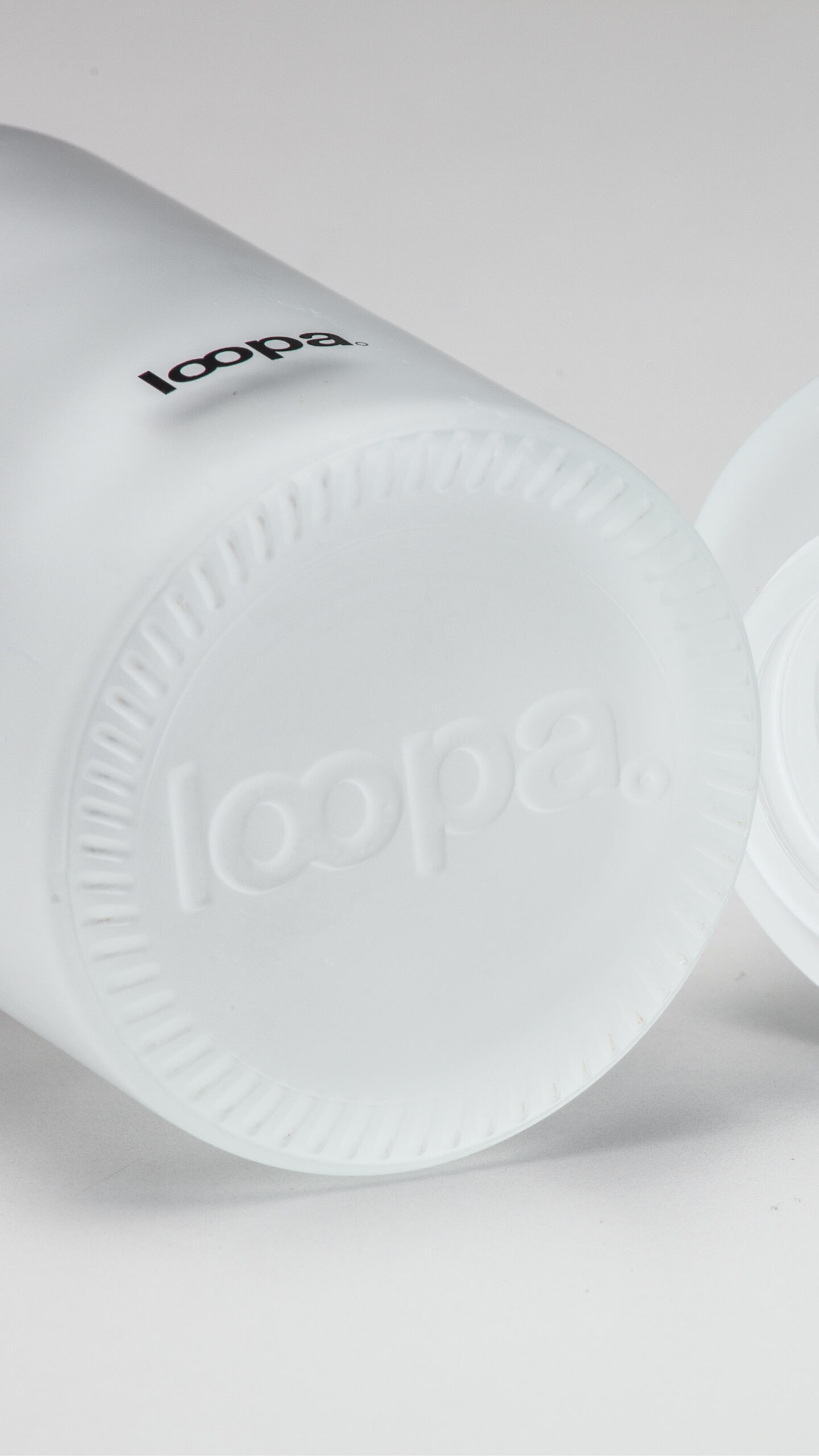
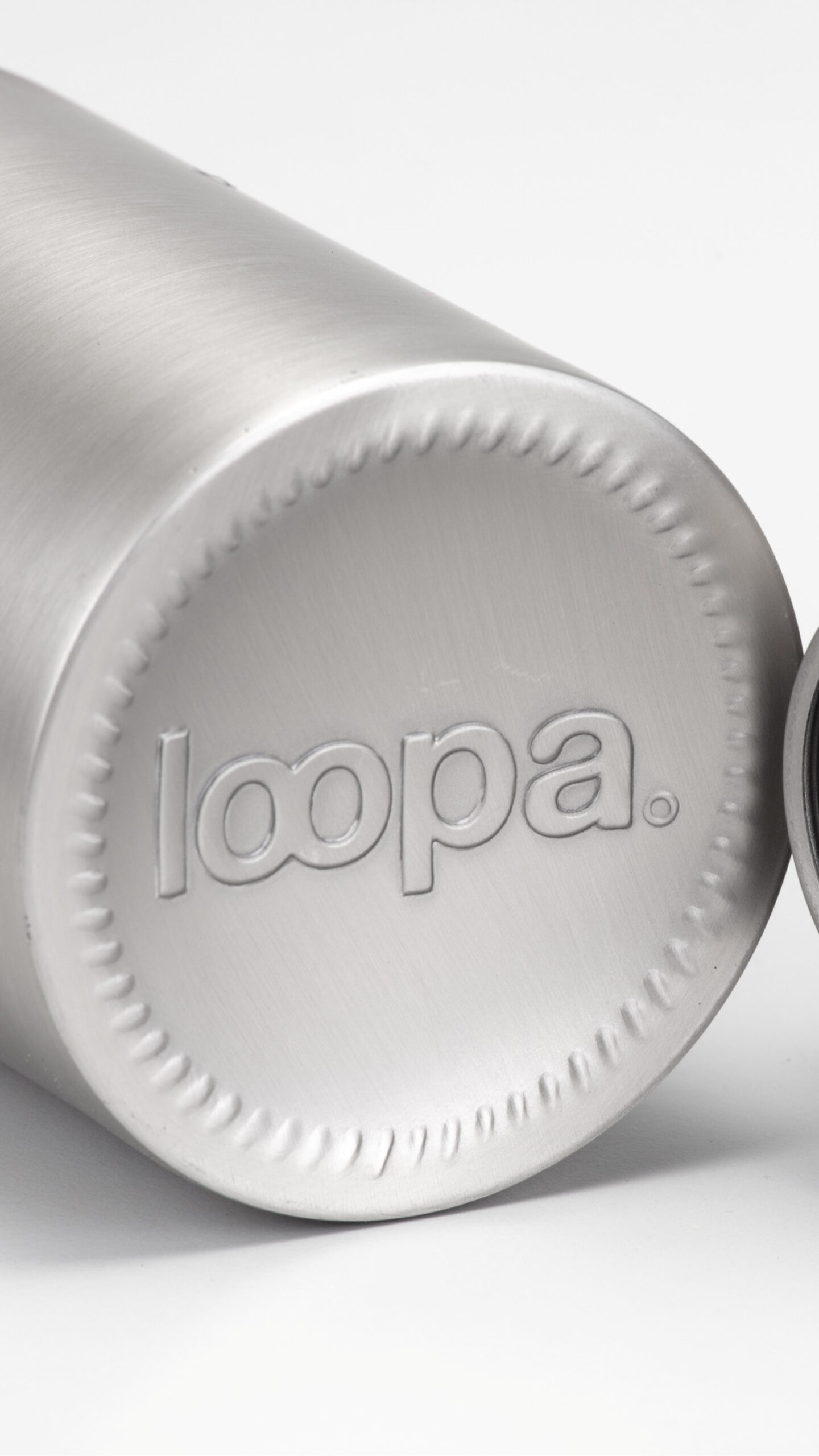
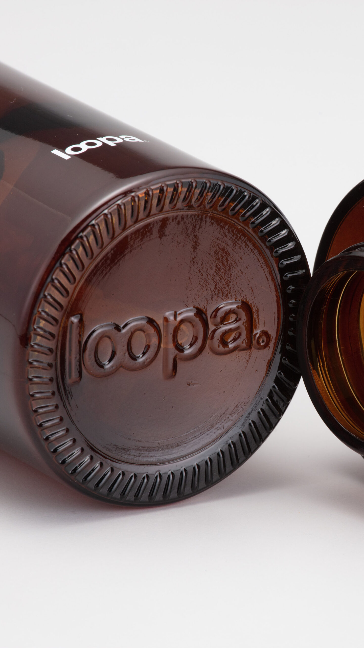
The LOOPA products consist of soap and diffuser refills but the Diffusers and Soap bottles themselves are made of three materials and are branded using embossing of the logo onto the bottom:
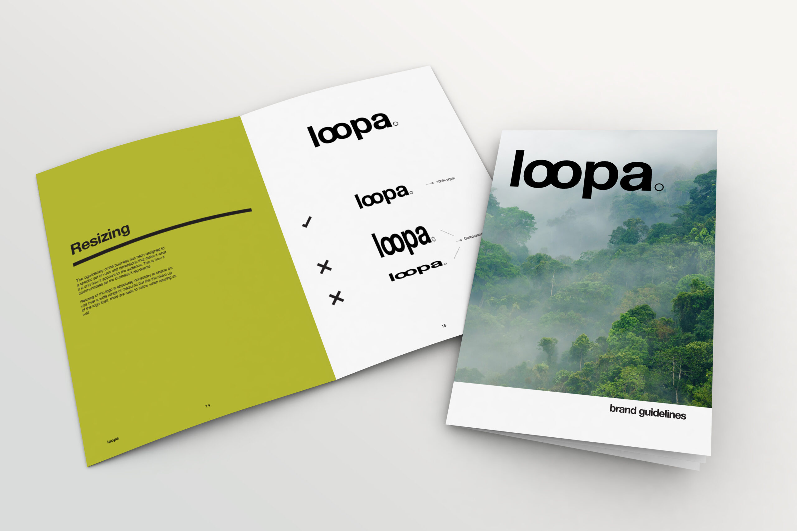
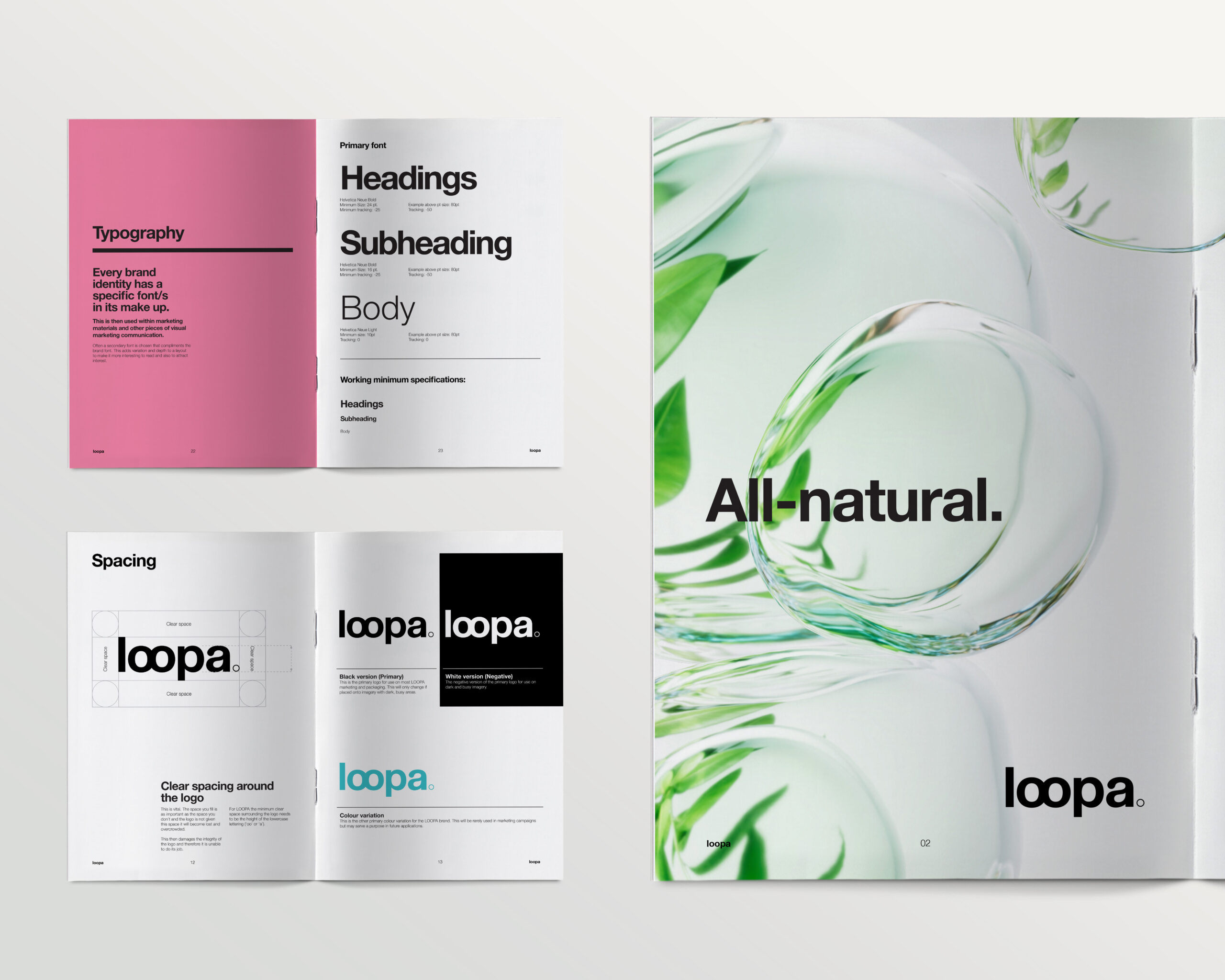
As part of the brand creation process, a full set of brand guidelines have been developed to support future marketing and visual creation using the brand and to retain consistency.
