The Hayes Parsons Group consists of three companies; Admiral Marine, Hayes Parsons Insurance Brokers and CMTIA. Each company has their own specialism and provides bespoke insurance solutions.
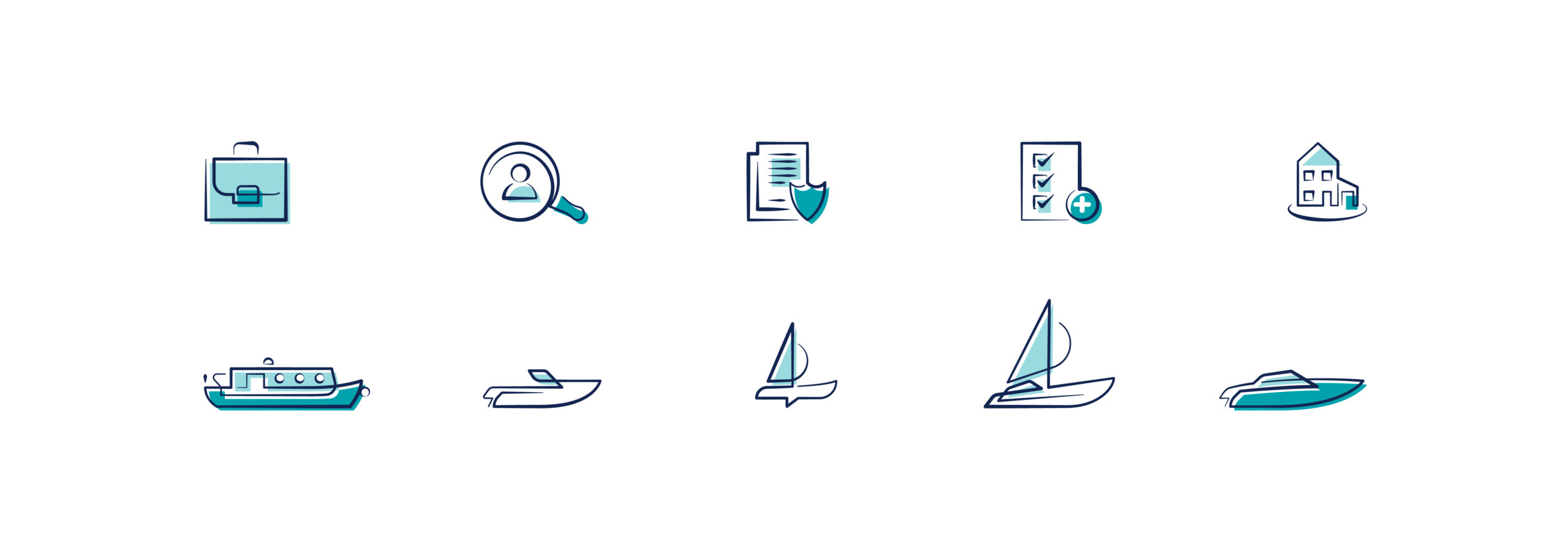
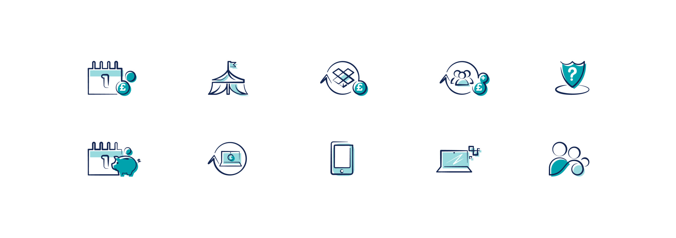
A new website was under development and required a bespoke set of symbols that would add more visual content to the site and illustrate the various services the company had to offer. Each set of symbols required a different colour scheme to represent each of the companies within the Hayes Parsons Group umbrella.
The brand is very modern as well as the industry sector they are in so a contrasting style was used that made the symbols stand out while not being overbearing. A modern style with a sketched tone, changing line thickness and off-centre shading made each symbol more interesting to view than the usual uniform styling we are used to.
Infographics
- Infographics


