Branding
VADOTECH rebrand
VadoTech, known as Zynit in China, is a testing company that tests vehicles and vehicle subsystems for the automotive industry. Founded in 1997 it now operates globally with bases in China, Germany and Singapore and has over 100 employees. As well as testing vehicles for manufacturers primarily on public roads, it also trains engineers and automotive professionals in working with high voltage electric vehicles from their Berlin base.
VadoTech/Zynit test vehicles to the point of error-free efficiency for maximum durability, sustainability and performance and test vehicles that are either new to market or in the concept phase for the purposes of validation and commissioning and is done with ‘real-world’ environment testing i.e. country, climate, altitude etc…
Acquired in 2021 by AB Dynamics, the brand was in need of refreshing to bring it up to date and to make it more visually comfortable under the AB Dynamics umbrella as well adding consistency and versatility for future marketing applications.
Brand refresh
-
Brand guidelines
-
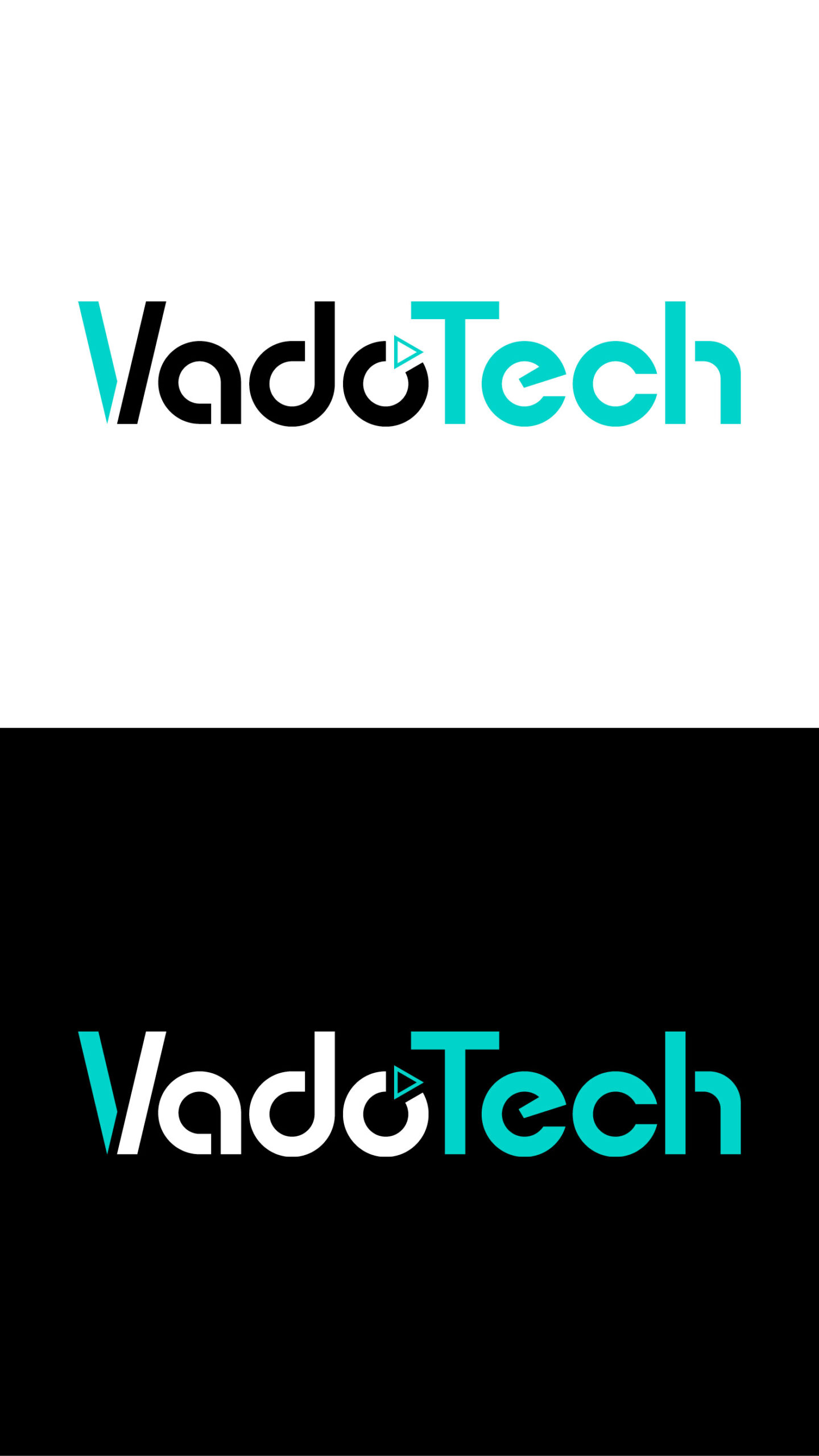
Logo design
-
Brochure
-
Web design
Discovery Session
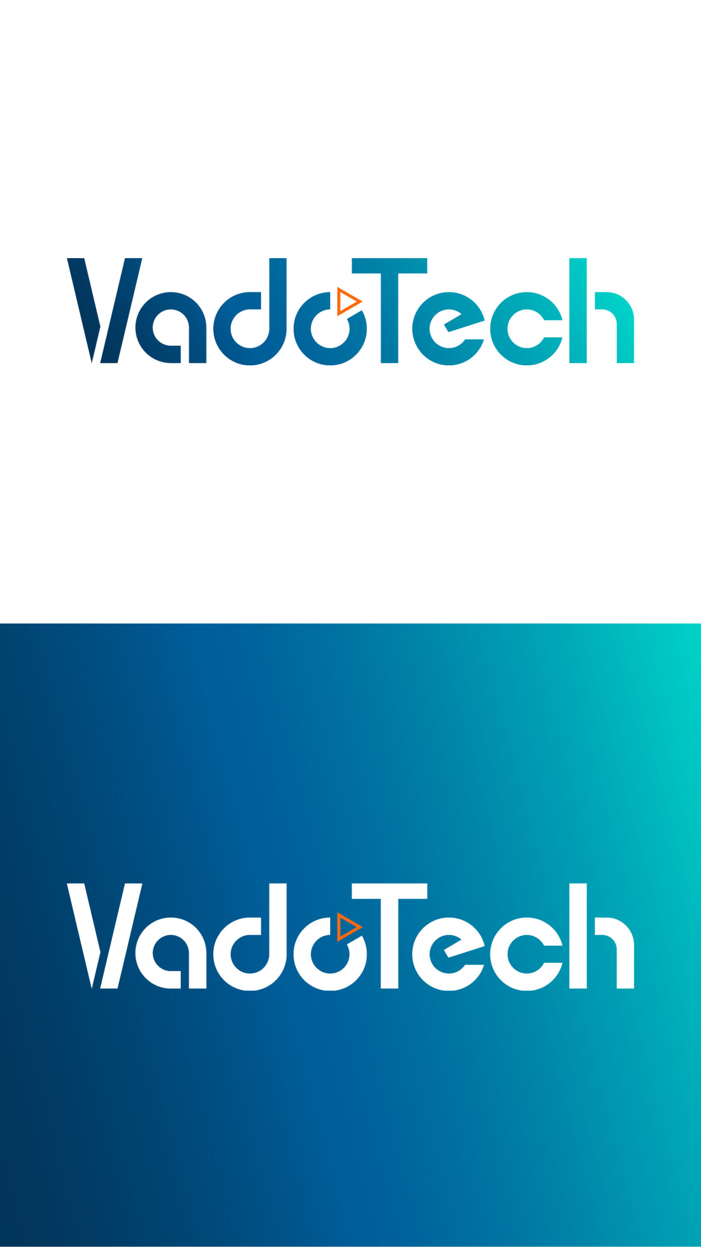
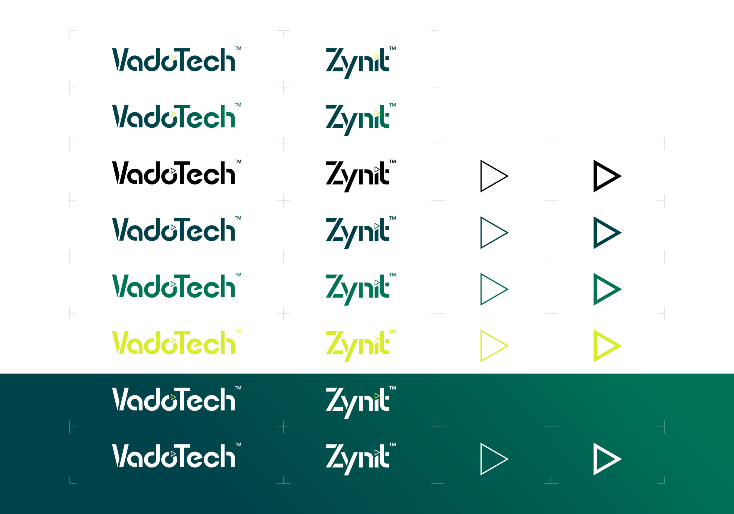
The discovery session for VadoTech not only required me to get to know this already well established business but, to understand a challenge I had not otherwise encountered before. The logo itself could not be adjusted in form but only in colour. The point of this branding project was to develop new ways of using the brand by creating new assets and a new visual identity within its marketing, essentially creating a whole new visual presence. This had to be done by creating four concept directions that visually represented the cutting edge and exciting services VadoTech deliver.
Mood boards
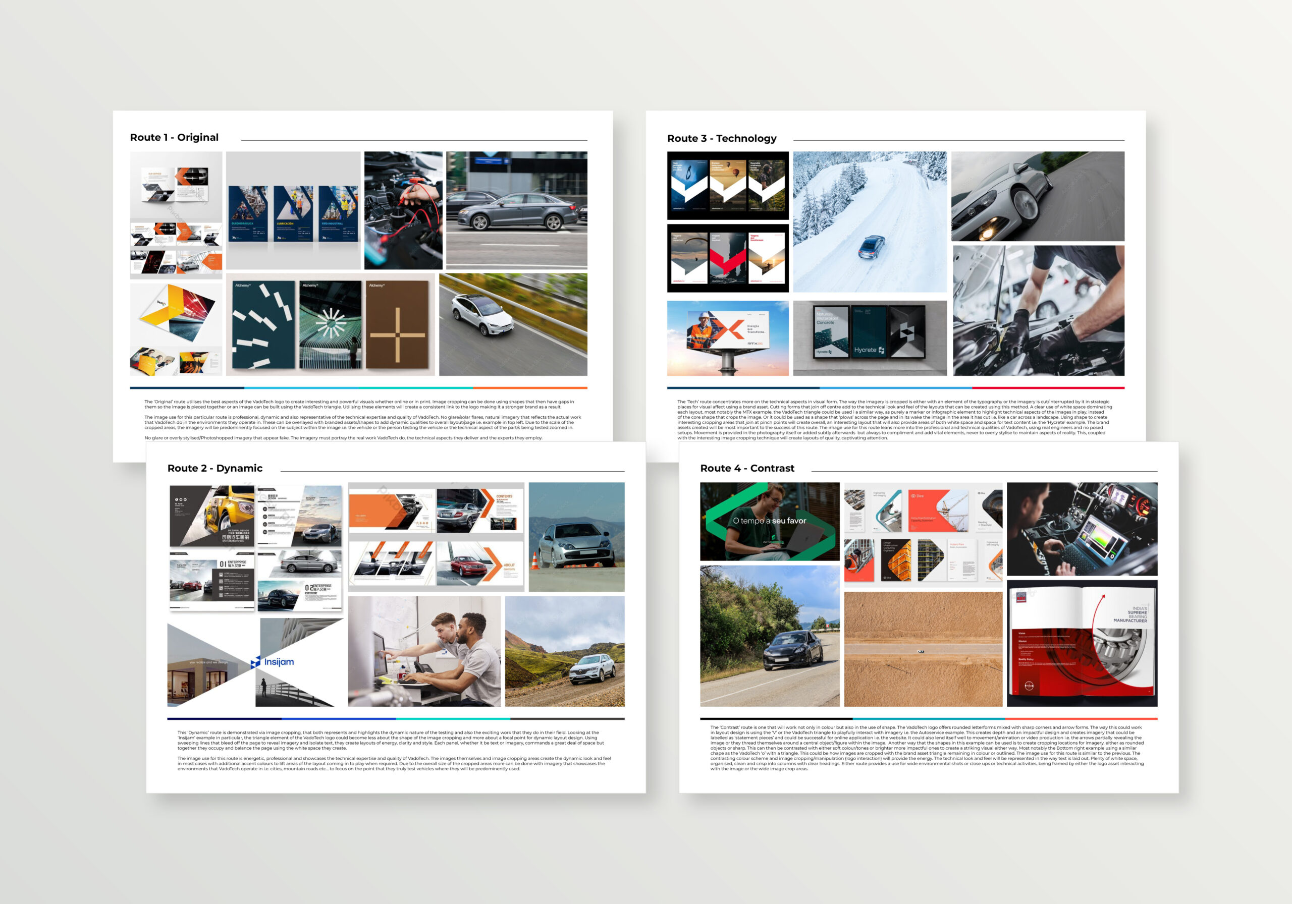
I tackled this part of the project by creating four mood boards to separate the directions out and to name them to make them easier to track and form an easy narrative within the project for the client to follow.
The mood boards were separated and had different themes and colour schemes to demonstrate the concept directions that I was going to follow.
Logo, concept colour schemes
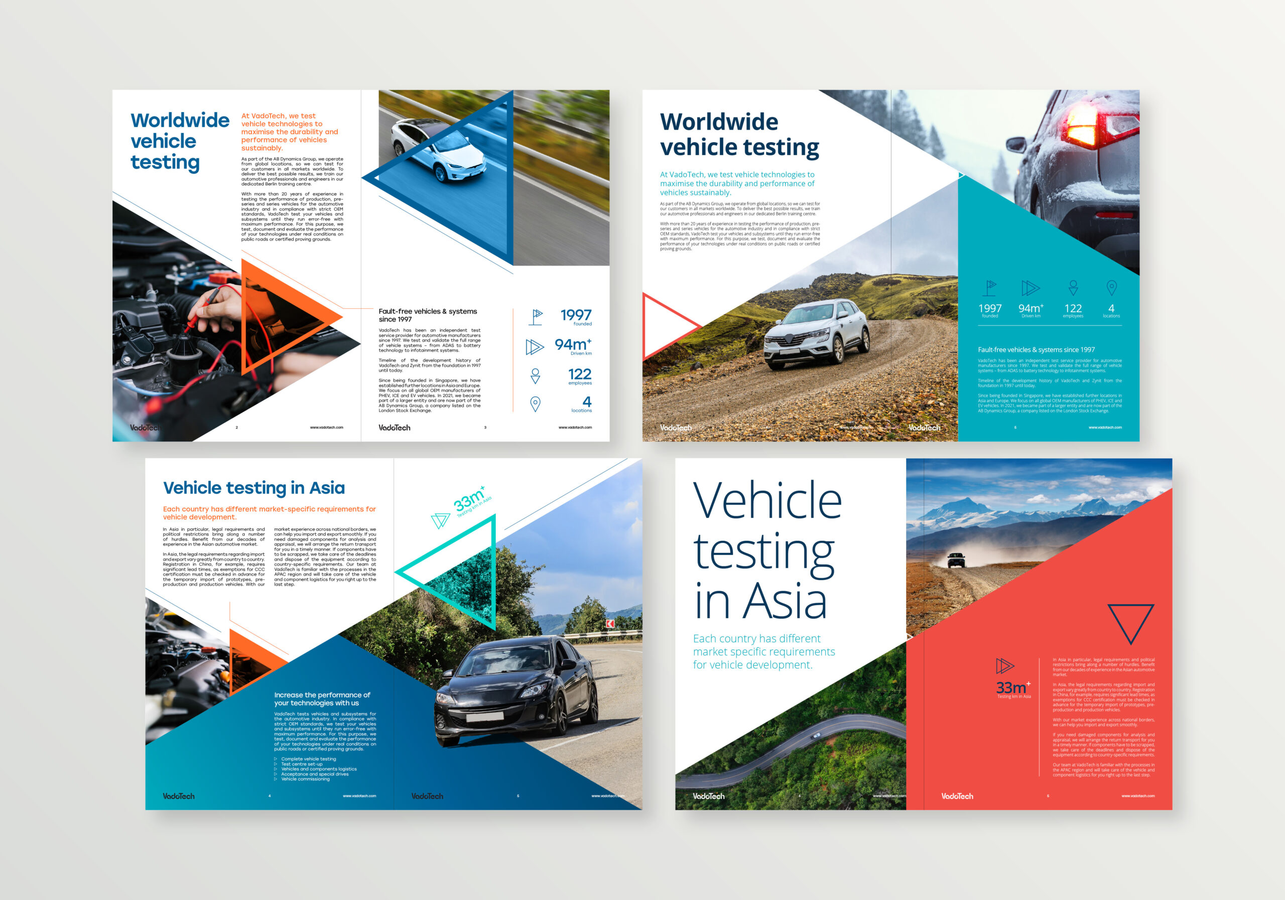
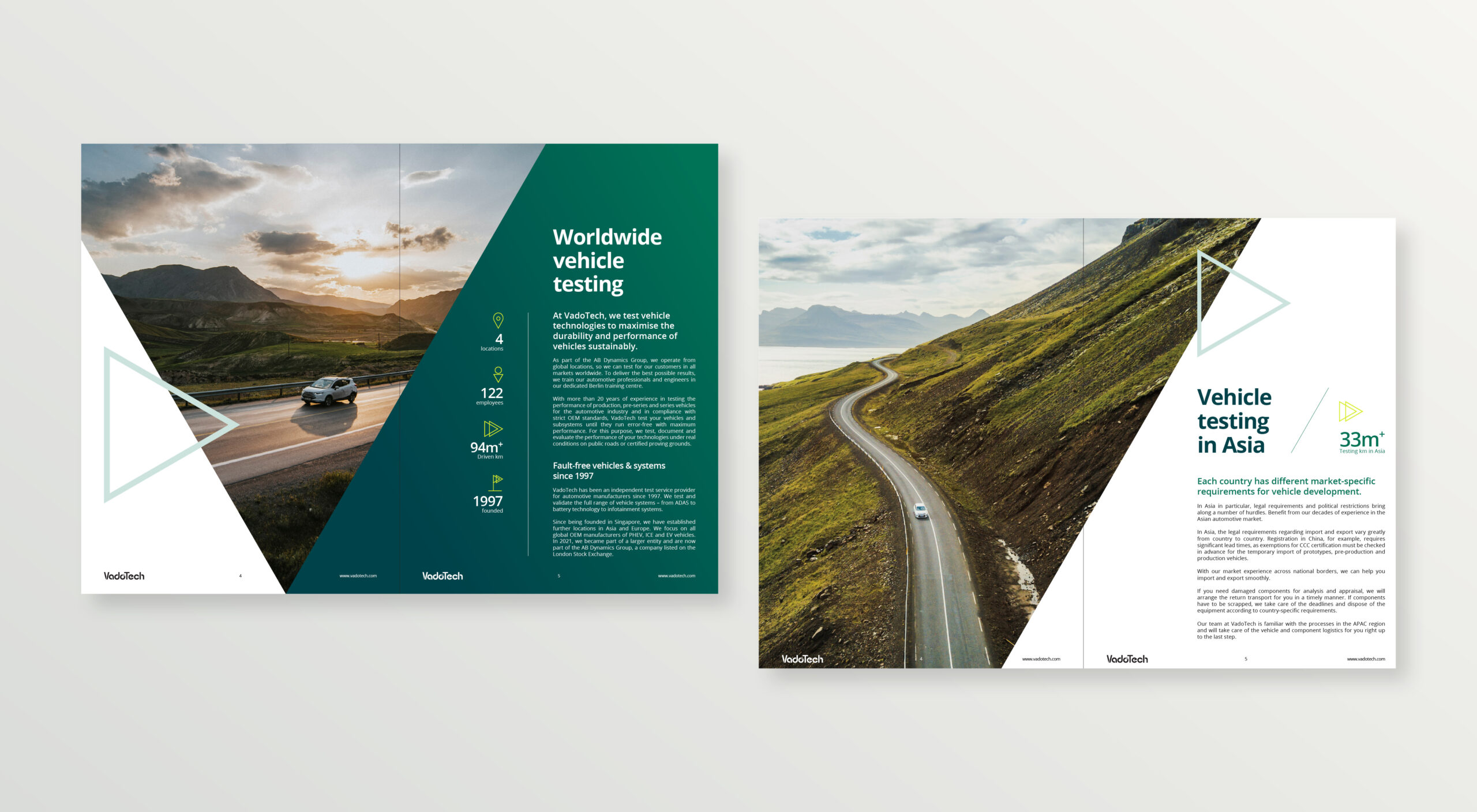
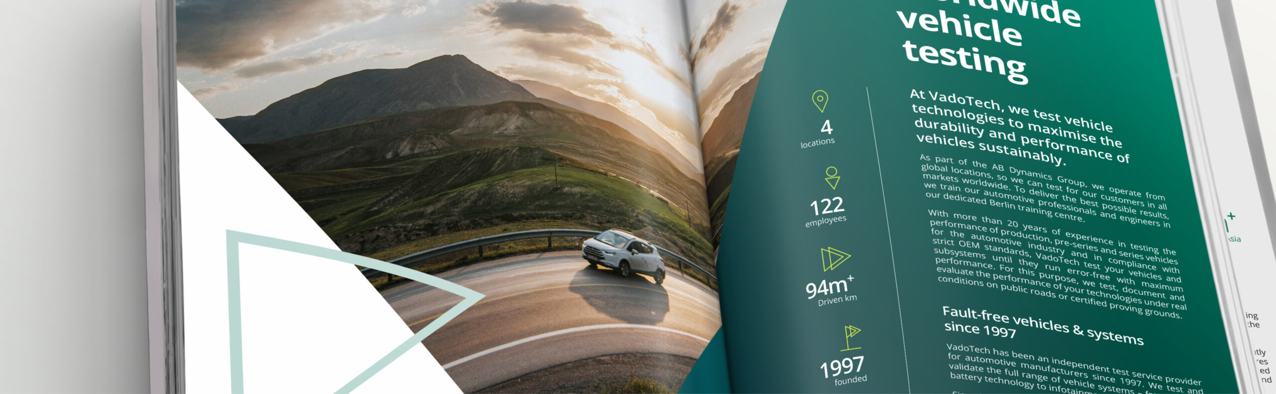
Brochure layout concepts
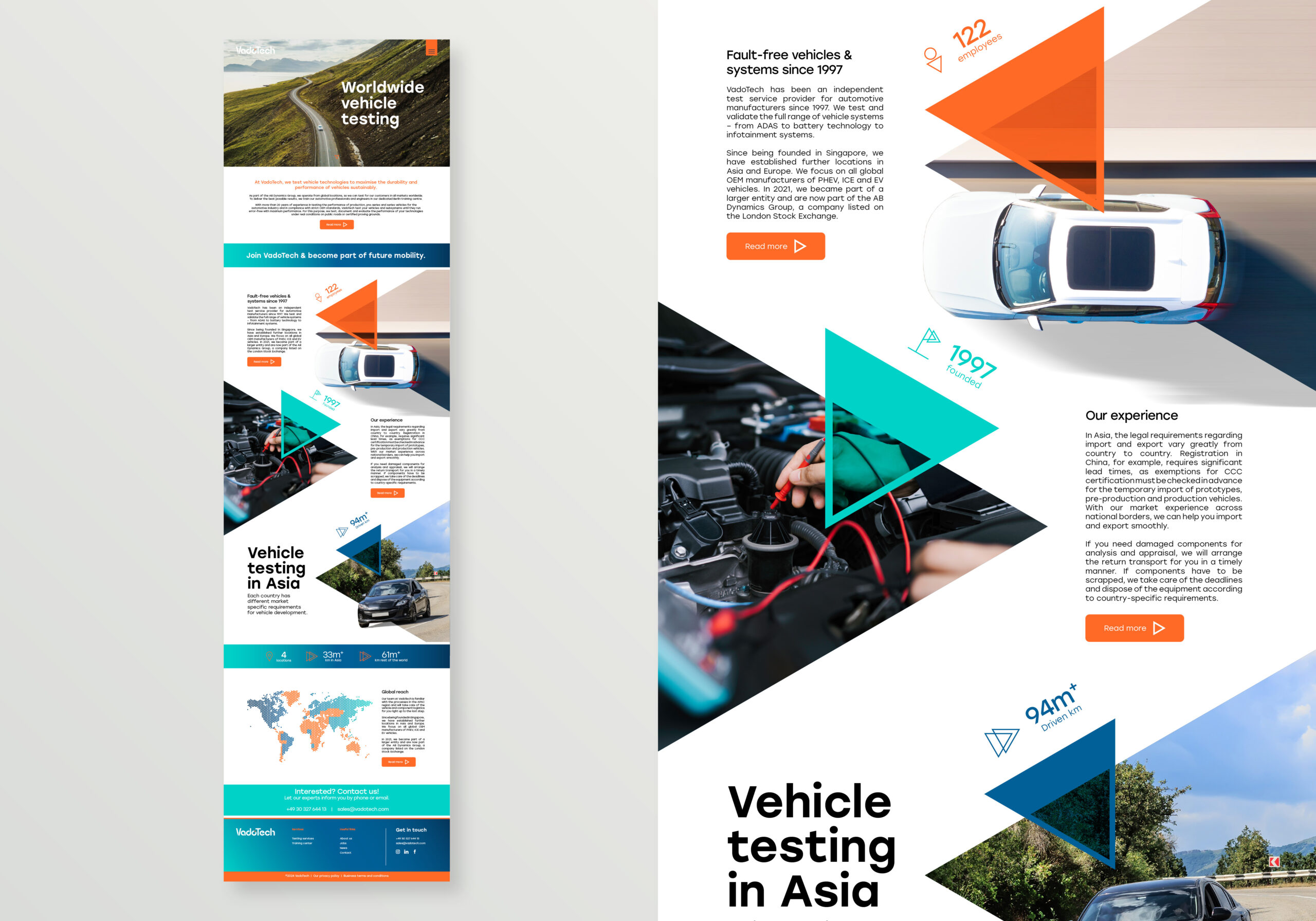
Using a new asset taken directly from the logo, I experimented with using this as a layout device as well as image cropping tool to create dynamic and exciting layout options to satisfy concept directions 1-4.
Brochure layout concepts 1 and 2
Brochure layout concepts 3 and 4
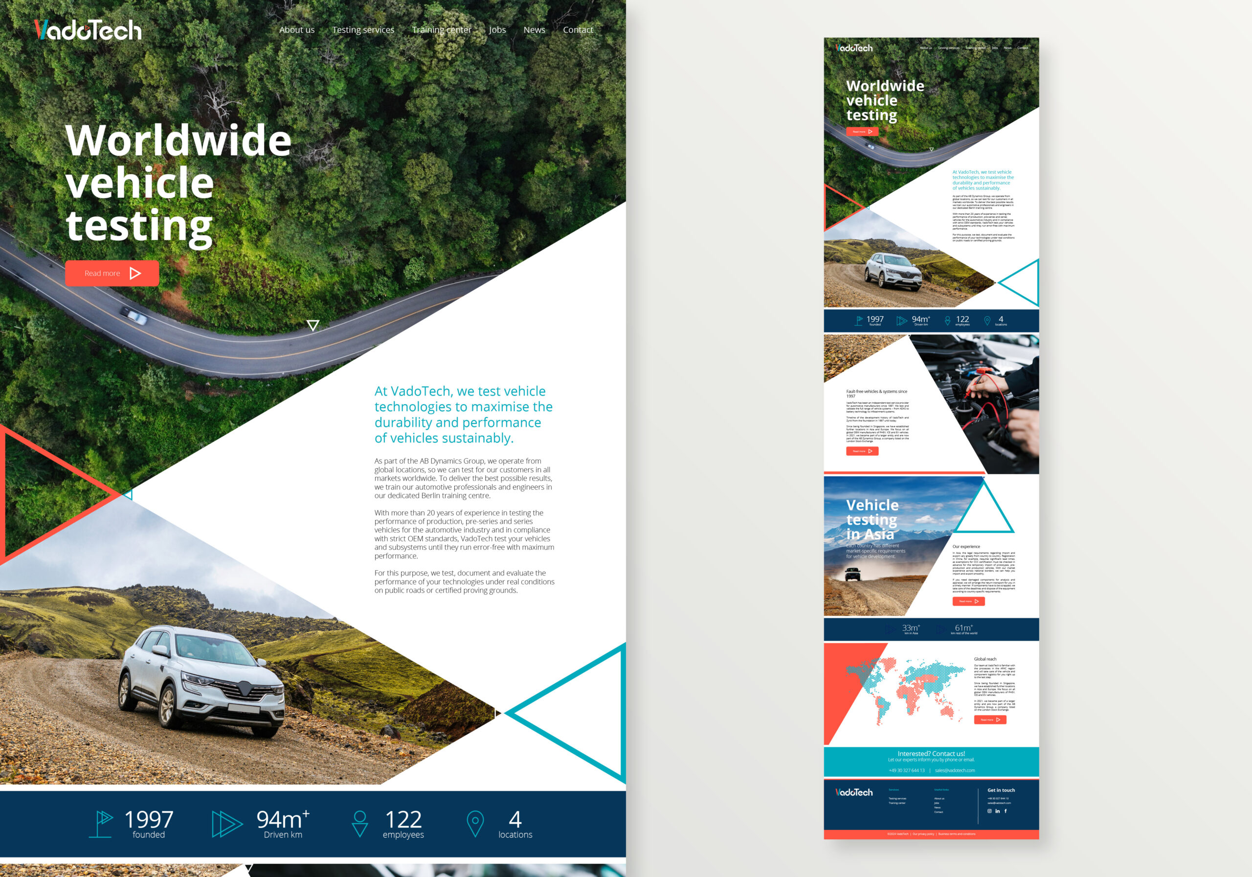
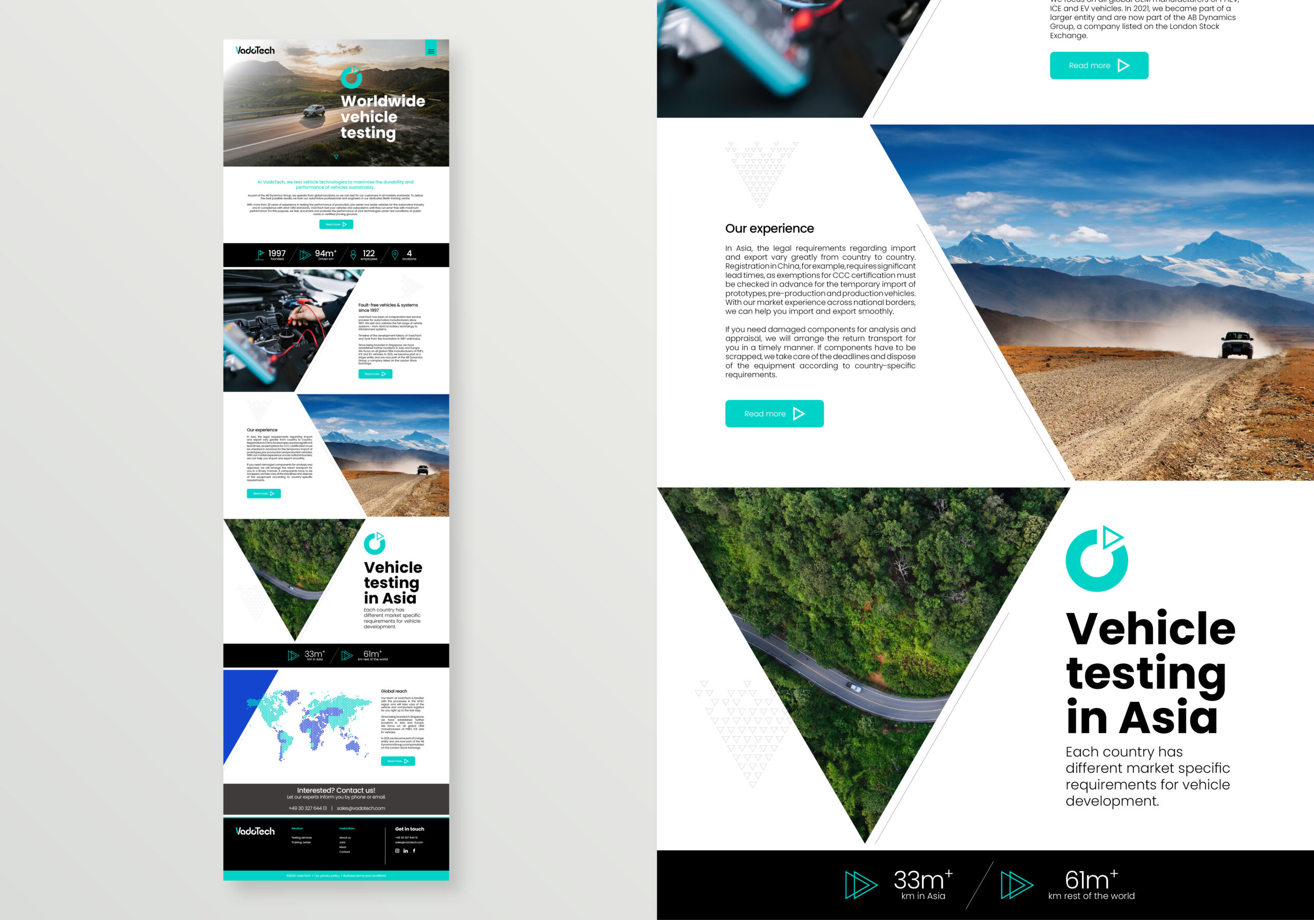
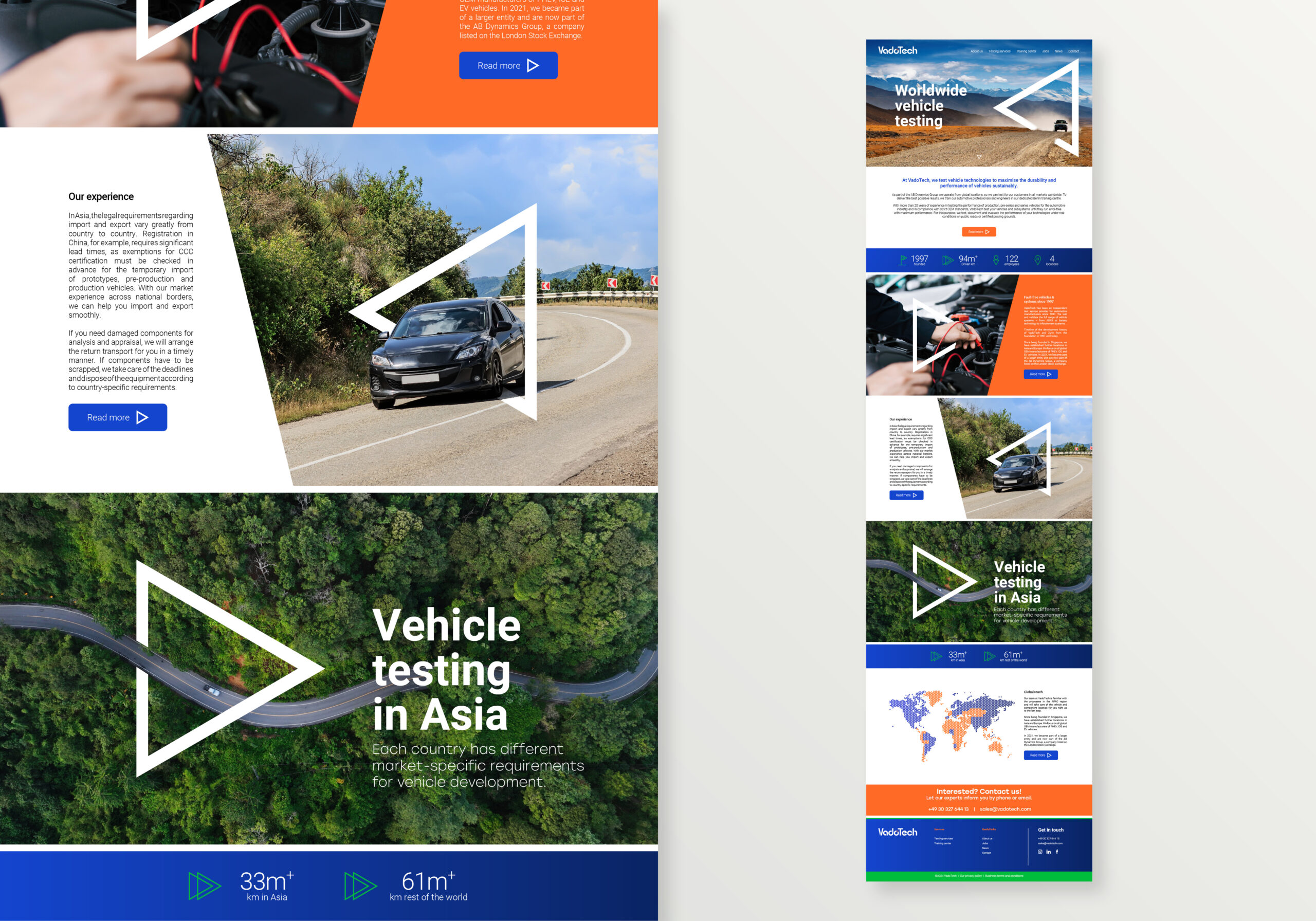
Web design concepts
Much like the brochure, the brand had to represented online so a landing page was created for each concept that demonstrated how each each concept would visually impact this environment.
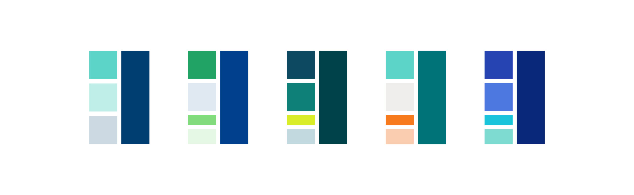
Colour refinement
After the concept stage I met with the client to gather feedback and to discuss the next steps for the project and one thing was clear, the colour schemes were not heading in the right direction but from a layout perspective there were great ideas that we could take forward to the next phase. More research was done to refine the colour scheme.
Next phase colour research
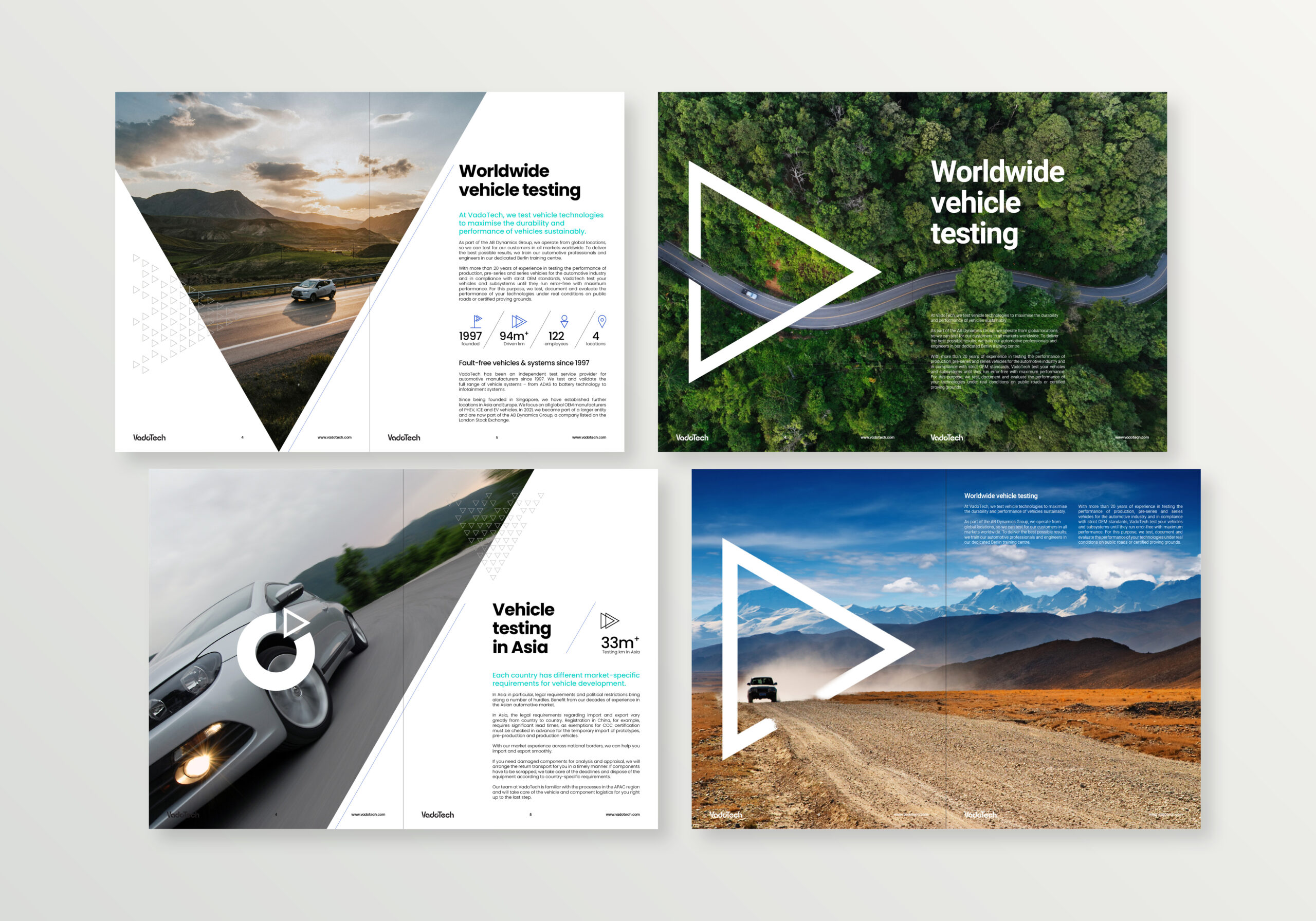
Further development & delivery
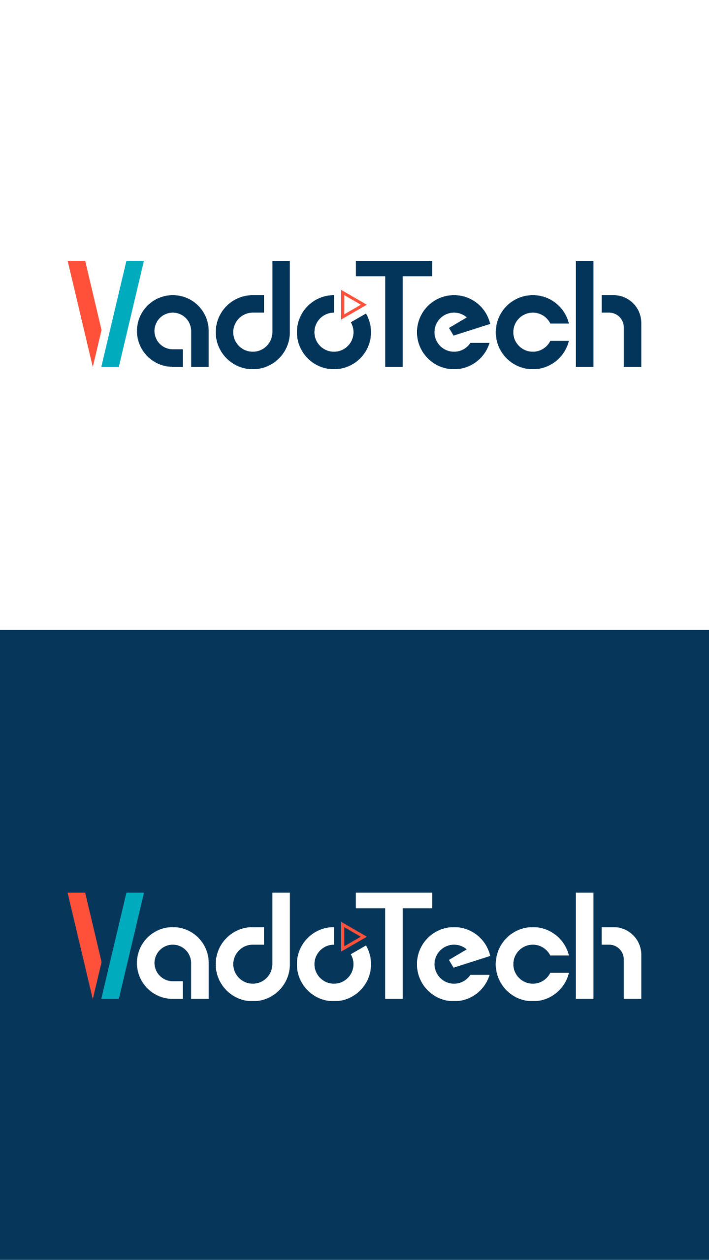
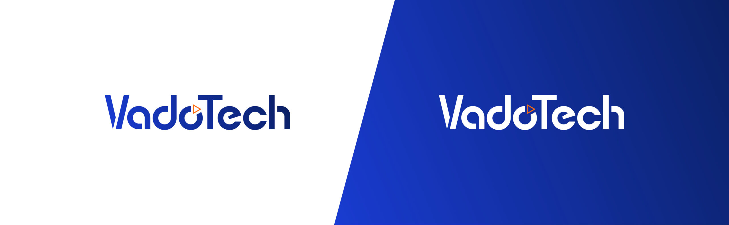
After the colour research, the new colours were added to two of the favoured concept directions and one stood out as the overall deliverable brand direction.
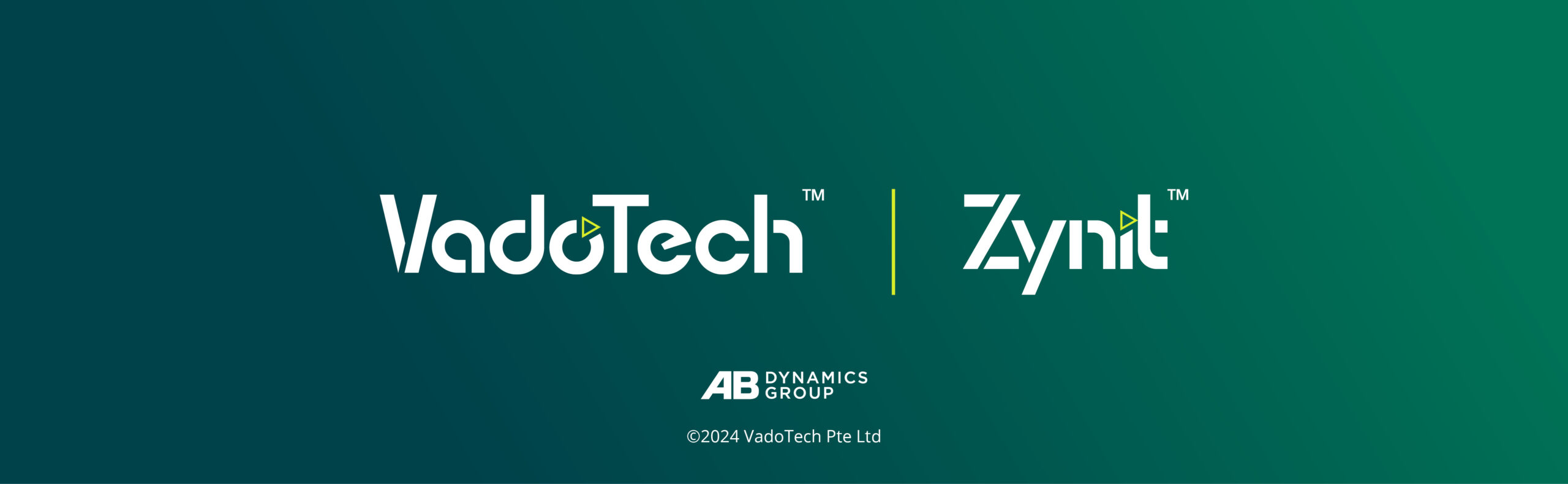
All deliverable logos and assets
Final brochure layout directions
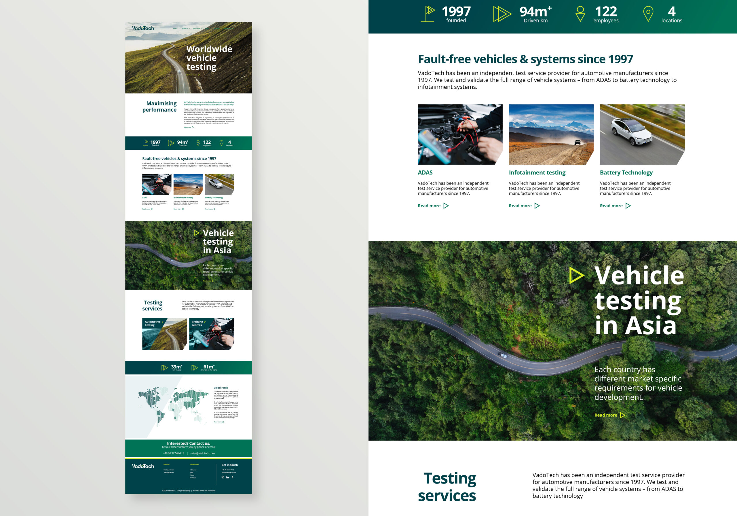
Final website layout concept direction
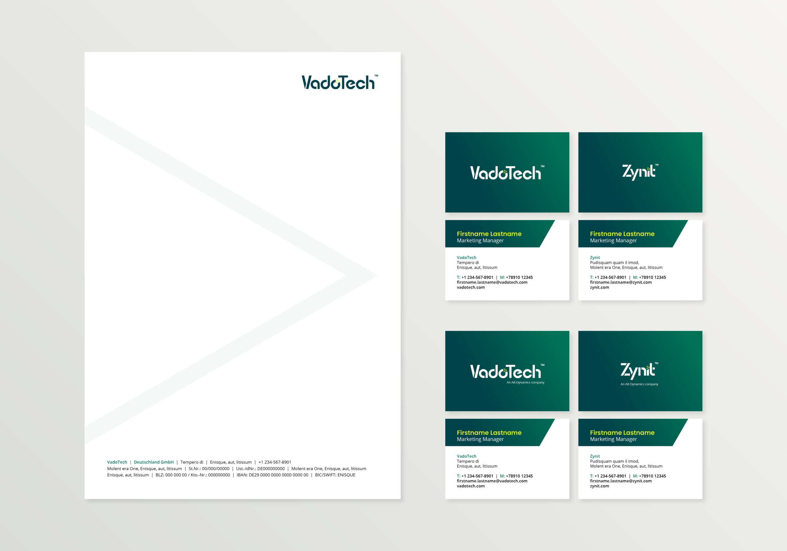
Final stationery that was developed at the end of the project
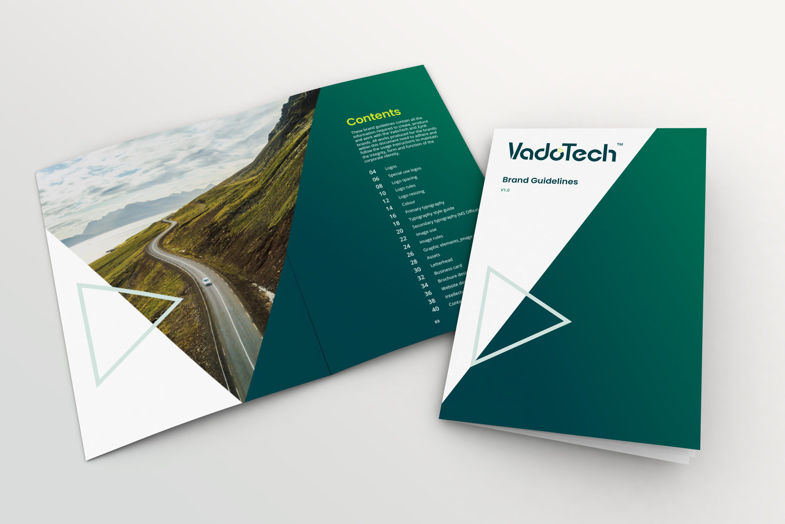
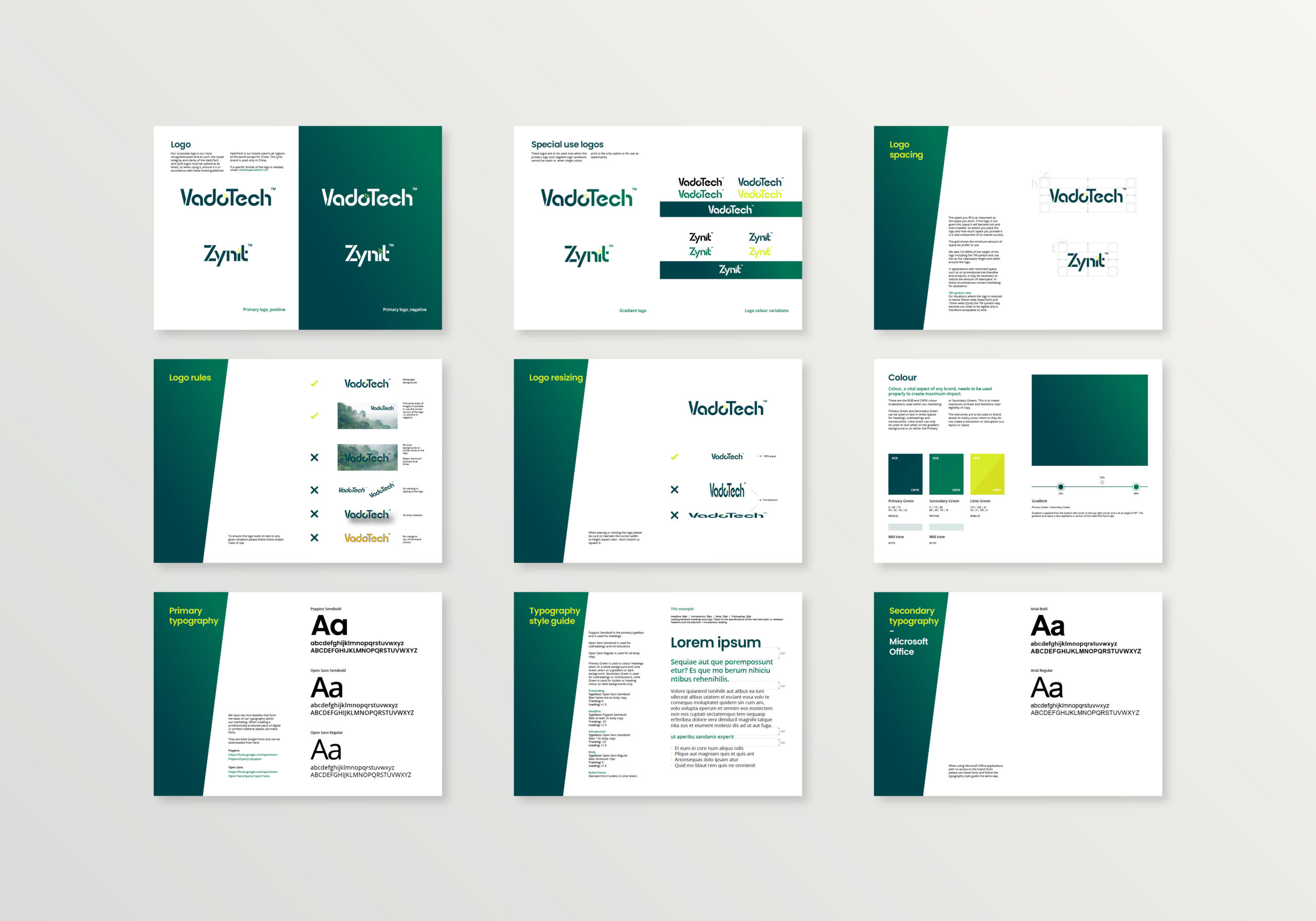
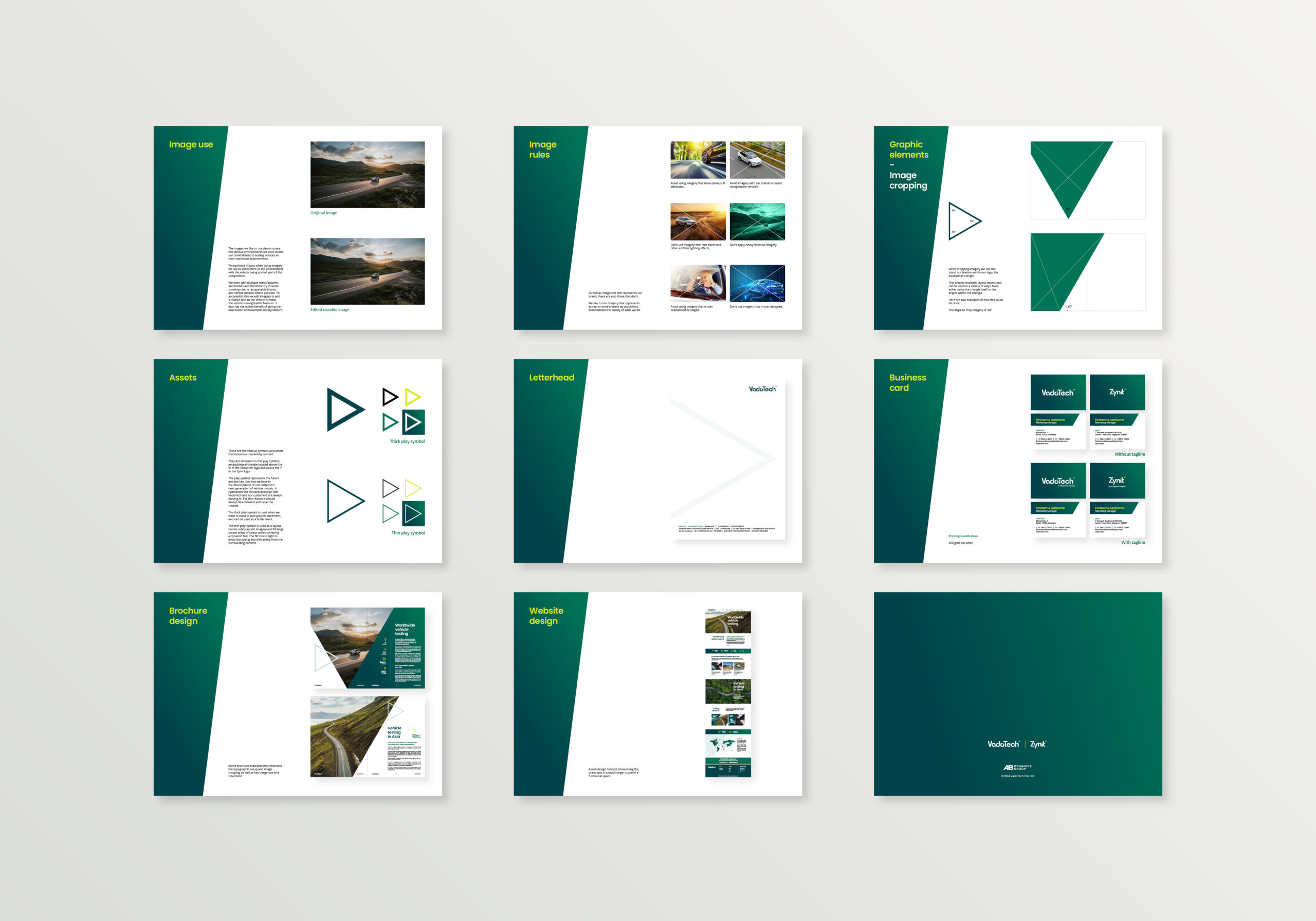
Brand guidelines
As part of the rebrand and to enclose all of our findings and work that was developed during the project, a full comprehensive set of brand guides was developed and delivered with all logo assets and and stationery products. This ensures that the guidelines set out are met and all visual work developed for VadoTech and Zynit are consistent and therefore strong.